Challenges & Solutions
1. Showcasing the Platform’s Value Proposition:
Challenge:
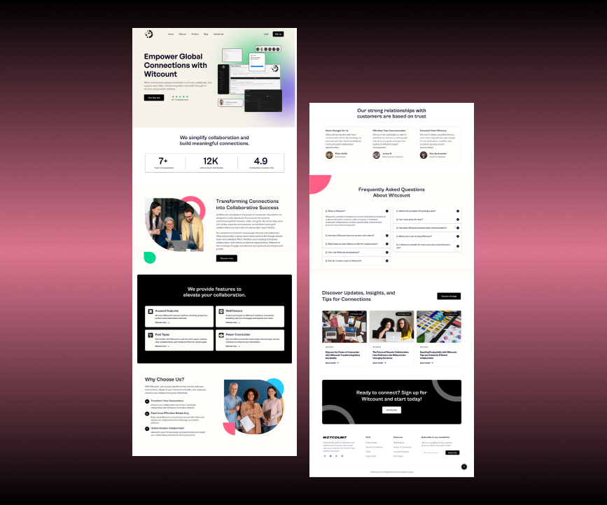
Witcount’s primary goal is to connect users, and the website needed to clearly communicate the platform’s benefits, such as the ability to share ideas and collaborate. A well-defined value proposition was essential to attract new users and convey the platform’s unique features.
Solution:
We designed a clean, modern homepage that immediately communicates Witcount’s value. The site includes compelling headlines, feature highlights, and engaging visuals that focus on collaboration and community-building. The homepage leads users into various sections to explore the platform’s functionalities, ensuring clarity on how Witcount supports both individuals and teams.
2. Creating an Engaging and User-Friendly Experience:
Challenge:
Witcount’s platform features a variety of collaboration tools, and the website needed to provide an engaging experience without overwhelming the visitor. The user journey had to be intuitive, leading them from curiosity to registration.
Solution:
We focused on a simple, responsive design with clear navigation. The website was structured to highlight key features of Witcount such as reactions, comments, post types, and collaboration tools. We implemented interactive elements like hover effects and smooth scrolling to keep visitors engaged. Calls to action (CTAs) were strategically placed to encourage sign-ups and exploration of the platform.
3. Optimizing for Mobile Devices:
Challenge:
Given that many users access SaaS platforms from mobile devices, ensuring a seamless experience on smartphones and tablets was crucial. Witcount needed a website that was responsive and easy to navigate across different screen sizes.
Solution:
We ensured that the website was fully responsive and optimized for mobile devices. The design adapts to various screen sizes, with touch-friendly elements and intuitive mobile navigation. This mobile-first approach guarantees that visitors can easily explore the platform’s features and sign up regardless of the device they use.
4. Incorporating Clear Calls to Action:
Challenge:
To drive engagement, the website needed clear calls to action (CTAs) to guide users toward signing up or learning more about the platform. This would encourage visitors to take the next step toward joining Witcount.
Solution:
We included prominent and strategically placed CTAs throughout the website, such as “Join Now,” “Discover Features,” and “Get Started.” These CTAs were designed to be visually appealing and stand out, leading users to the registration page or relevant sections of the site.
5. Ensuring Fast Load Times and Performance:
Challenge:
Witcount’s website needed to provide a fast and smooth experience for users, as slow load times could deter visitors from engaging with the platform.
Solution:
We optimized the website’s performance by compressing images, minifying code, and using efficient hosting solutions to ensure that the website loads quickly. This attention to performance ensures that users enjoy a seamless experience, whether they’re exploring the site on desktop or mobile.
Key Highlights
- Clear Value Proposition: The website effectively communicates the platform’s unique value of connecting people for collaboration.
- User-Friendly Design: A simple, intuitive layout that guides users through the platform’s features and encourages them to sign up.
- Mobile Optimization: Fully responsive design to ensure an excellent experience on all devices.
- Effective CTAs: Strategically placed CTAs to drive engagement and encourage sign-ups.
- Optimized Performance: Fast load times and smooth performance for a seamless user experience.
Results
- Increased Engagement: The website design and strategic CTAs led to a noticeable increase in user registrations.
- Higher Conversion Rates: Clear communication of Witcount’s value proposition and mobile optimization resulted in a smoother path to sign-ups.
- Positive User Feedback: Visitors appreciated the website’s simplicity, speed, and clarity about the platform’s offerings.
Conclusion
Witcount now has a professional, user-friendly website that clearly communicates its mission to connect users and facilitate collaboration. With a clean design, clear calls to action, and a focus on user engagement, the website provides a solid foundation for attracting and retaining users.
Apexia is proud to have helped bring Witcount’s digital presence to life, contributing to their mission of fostering collaboration in the digital age. We look forward to seeing Witcount continue to grow and succeed.