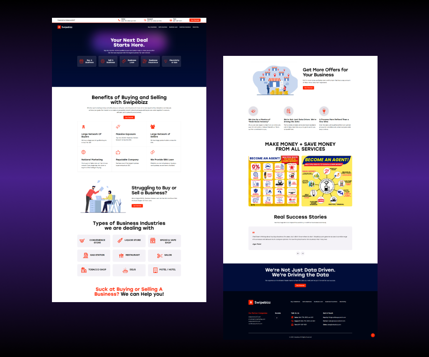
Challenges & Solutions
1. Presenting a Wide Range of Services Clearly
Challenge:
Swipebizz offers multiple business services, and the original website struggled to present all of them clearly without overwhelming visitors. The company needed a way to show everything it offers—buying, selling, loans, insurance, and utilities—without clutter.
Solution:
We created a homepage layout that highlights each service with its own dedicated icon and section. The top navigation and hero section include direct links to key services, making it easy for users to explore what Swipebizz offers from the start.
2. Making the Website Fully Responsive
Challenge:
Swipebizz needed a website that worked well on all devices. Many users visit from mobile phones, and the site had to be easy to read and navigate on smaller screens.
Solution:
We developed a responsive design that adjusts smoothly across devices. Whether on a desktop, tablet, or mobile phone, the layout remains clean and user-friendly, with tap-friendly buttons and fast loading times.
3. Including All the Necessary Information
Challenge:
Swipebizz wanted to include a lot of useful content—benefits, industry types, agent program, success stories, and more—without making the page feel too busy.
Solution:
We used structured sections with white space and visual hierarchy to organize the content. Icons, illustrations, and headings guide the reader’s eye, while expandable sections and CTAs help keep everything digestible.
4. Encouraging User Interaction and Lead Generation
Challenge:
The goal was not just to inform visitors but to convert them—encouraging people to buy, sell, or inquire about services.
Solution:
We added clear, action-focused buttons like “Get Started,” “Become an Agent,” and “Contact Us” throughout the page. These are placed strategically to encourage user interaction without disrupting the flow.
Key Highlights
- Service-Focused Layout: Every Swipebizz service is given space and clarity to stand out.
- Responsive Design: Smooth and optimized for all screen sizes.
- Content-Rich Yet Clean: All information included without crowding the layout.
- Strong Visual Flow: Icons, headings, and callouts make navigation easy and engaging.
- Lead-Generating CTAs: Buttons and forms that guide users toward taking action.
Results
- Improved User Experience: Visitors can now easily understand and access the full range of services.
- Increased Mobile Engagement: The responsive design led to better performance and usability on phones and tablets.
- More Inquiries and Conversions: Clear calls to action and a smoother flow have led to more sign-ups and business inquiries.
Conclusion
The redesigned Swipebizz website now delivers a professional, modern experience that reflects the company’s broad service offering. With clear navigation, responsive design, and a focus on both clarity and conversion, the new site sets Swipebizz up for stronger growth and better customer interaction.